Not long ago, a client asked me to take a look at their home page and see if I could figure out why it was loading slower.
I did, and, I did.
I found a 42mb photo (that is way big!) loaded into the top banner area. They had loaded in a photo from a stock photo site. At full resolution. While it had shrunk it to fit the box on the page, at actual size the image area was almost 20 square feet. Which is bigger than you need on a web site.
Don’t do this, please.

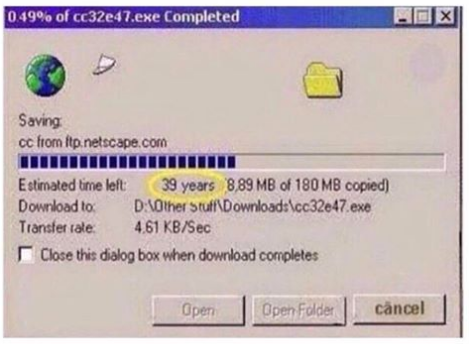
Back in the 90s, when web was new and connections were slow, the emphasis for web people was always on making our graphics as small as possible, because back then, downloading anything that was 42mb would have taken forever.
Then, modems got faster, cable internet was popular, and sites were using larger images and graphics – with no real issues.
But that time has passed and we’ve come almost full circle back to the olden days.
Mostly because of phones.

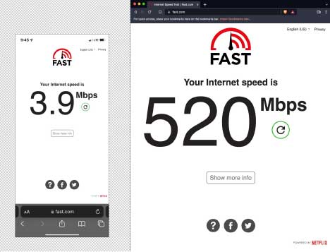
Websites need to load fast on phones, which have more limited connectivity and slower speeds (still fast historically, but not as fast as good wifi or hardwired). But, today customers expect the same speed and performance on their phones as they do on a laptop. Also, Google will penalize you for slower loading pages and impact where you show up in search results, especially on mobile devices.
And in addition to images, today’s websites load a lot more content, scripts, tracking, and other files than they did in the 90s.
So please make your images smaller. Don’t upload them directly from your phone, your stock photo site, or your camera. Because what else has happened is – hi-res images have become much higher res then even a few years ago. Which means even bigger files to manage.