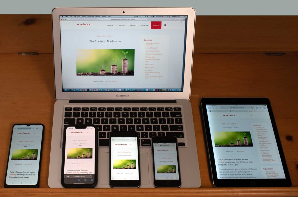
“Mobile Browsing Overtakes Desktop Browsing” – a headline that we have seen time and time again within the land of websites. With it coming as a shock to none, since many social media platforms are the most visited sites on the internet, and only 21% of all social media traffic is being accessed from a desktop computer.
When mobile browsing first became readily available – back when we started working with it – most mobile web use was sort of a last option/emergency while on the go.
Today, it’s normal and every day. And the rest of the World Wide Web has been following close behind social sites, with an estimated 50% of all traffic to websites being from a mobile device.
So how can your website be ready for mobile visitors?
The first thing to keep in mind when deciding the development and design of your website is that “mobile” doesn’t just mean a cell phone, and it doesn’t just mean the model of phone you have, either. These days developers have to take into consideration iPads, Amazon Fire, iPhones, Androids, and at least one person who still is hanging onto that BlackBerry phone for dear life.

It used to be that we would take these different users into account by building multiple versions of the website. Anyone who remembers trying to check your Facebook in the early days of mobile internet might remember the prompt to use the mobile version of the website.
These days, and for the last decade or so, we use “responsive web design” or a “Mobile First” design method. So what is responsive or mobile about it? A responsive design has aspects of the site such as layouts and grids that are fluid enough to allow for varying screen sizes. When you use a smaller screen, elements on the page adjust to fit or stack or otherwise adapt.
One of the best examples of this can be seen with images.
In the past when an image was placed on the website it was with the intent that a desktop browser would be accessing the site. But when a mobile user viewed the same site, the image would not resize to fit the user’s screen, meaning that certain content might not have been readable, menus might not function properly, and ultimately the user would have a negative experience. Boo.
At this point, we can build designs with flexible grids by adjusting sizes using flexible units such as percentages rather than more rigid units such as pixels or points.

Okay, so why is this important?
Improved User Experience: Improving the website function of the user ensures that you are giving your website the best chance for the user to take further action such as purchasing from the site or converting them into a lead. If they are frustrated enough to leave without any further action, it is indicative of a low user experience.
SEO Boost: Google has been very open with the fact that they are looking for sites that are optimized for mobile to place higher in search results. Having a responsive website can mean the difference between being ranked first or fourth on the Google search results which can mean the world to a small business.
Future-Proofing (up to a point): At RPS we want our clients to have a website that will last. Having a responsive website means that even as new screen sizes come out, your website will be able to adapt, and will result in fewer major redesigns. Of course, this might change in the future – who knows how long it will be before we are optimizing websites for Neuralink (or SkyNet or who knows), but it is as future-proof as it can be for now.
How do I know if my website is responsive?
There are a few steps someone can take to see if your website is responsive or designed for mobile. The quick way is to change your browser window size and see what happens. If elements shift and stack on a smaller screen, chances are it’s at least a little responsive.
Or you can book a consultation with us and we can test the site for you and give feedback.
If you are ready for an updated website and want a site that is ready for your mobile visitors, you can book a call with us here: CALENDLY LINK